
Did you know that 88% of online consumers are less likely to return to a site after a bad user experience? Imagine losing nearly nine out of every ten potential customers simply because your website isn’t up to par. How can businesses make their digital presence both appealing and effective? Let’s tell the story of UI/UX and its crucial role in digital marketing.
Table of Contents
- What is UI/UX?
- The Impact of UI/UX on Digital Marketing
- Actionable Tips to Improve UI/UX
- Simplify Navigation
- Optimize for Mobile
- Focus on Speed
- Case Studies: Success Stories
- Conclusion
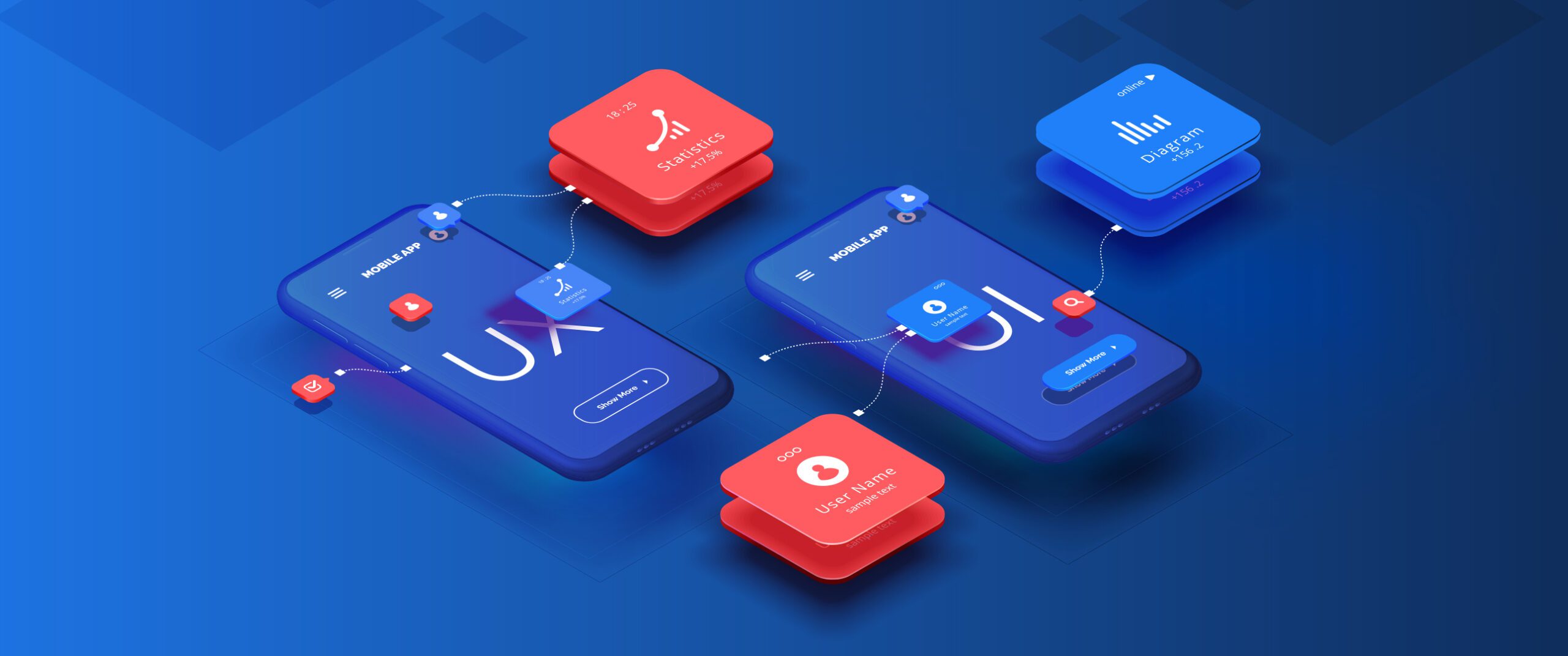
What is UI/UX?
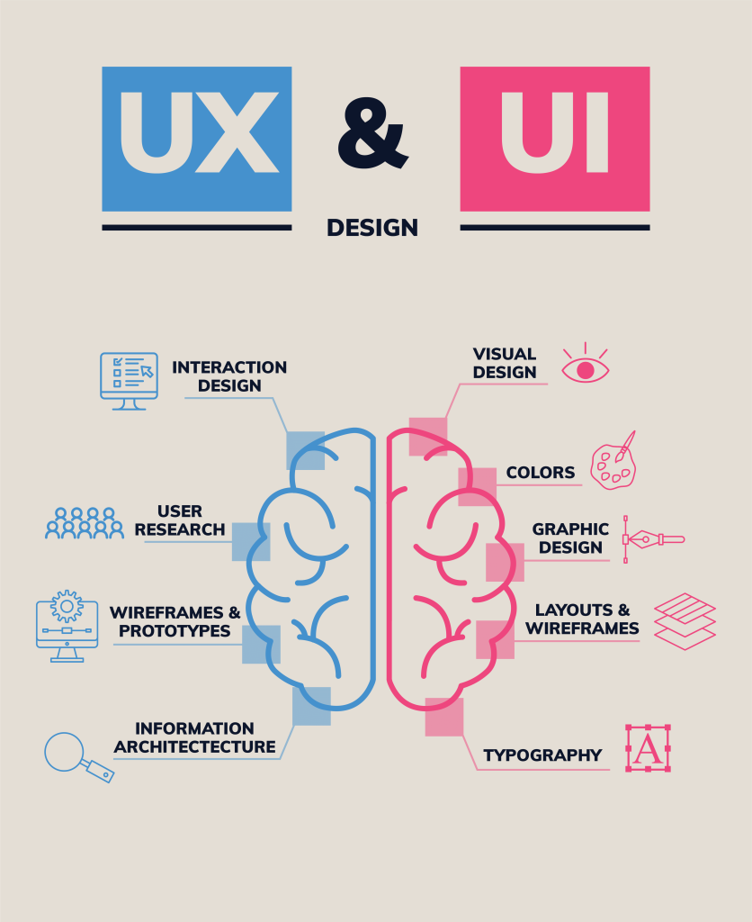
UI (User Interface) and UX (User Experience) are two fundamental aspects of web design and development. UI focuses on the visual elements and interactive features of a website or app, ensuring they are aesthetically pleasing and functional. UX is about the overall feel of the user’s interaction with the product. It involves understanding the user journey and creating a seamless, enjoyable experience.
UI/UX forms the foundation of your digital strategy. Without a solid user interface and user experience, even the most compelling content and marketing efforts can fall flat.
The Impact of UI/UX on Digital Marketing
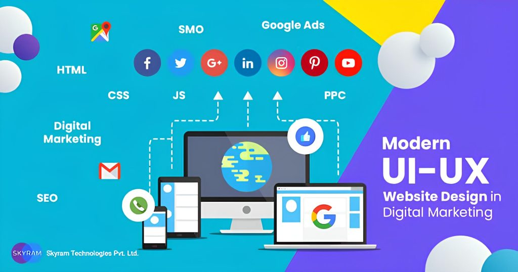
In digital marketing, first impressions are everything. A poorly designed website can drive away potential customers before they even have a chance to engage with your content. A study by Stanford shows 75% of users judge a company’s credibility based on its website design.
Good UI/UX design enhances user satisfaction and increases the likelihood of conversions. Here are some key ways UI/UX impacts digital marketing:
- Increases Engagement: An intuitive interface and smooth user experience keep visitors on your site longer, reducing bounce rates and increasing the chances of conversion.
- Boosts SEO: Search engines prioritize websites that provide a great user experience. Factors like site speed, mobile responsiveness, and user-friendly navigation all contribute to better search engine rankings.
- Enhances Brand Perception: A well-designed website reflects professionalism and builds trust with your audience. This positive perception can lead to repeat visits and customer loyalty.
- Improves Conversion Rates: Clear calls-to-action, easy navigation, and a pleasant user experience all contribute to higher conversion rates. When users can effortlessly find what they need, they’re more likely to make a purchase or fill out a form.
Actionable Tips to Improve UI/UX
Improving UI/UX doesn’t have to be a daunting task. Here are three actionable tips to help you enhance your digital marketing efforts through better UI/UX design.
Simplify Navigation
Users should be able to find what they’re looking for quickly and easily. Complex menus and cluttered pages can frustrate visitors and lead them to abandon your site.
How to Simplify Navigation:
- Use a Clear Structure: Organize your menu items logically, grouping related content together.
- Minimize Menu Options: Limit the number of options in your main menu to avoid overwhelming users.
- Include a Search Bar: A search feature helps users quickly find specific information without having to navigate through multiple pages.
Optimize for Mobile
With over half of all web traffic coming from mobile devices, it’s crucial that your website is mobile-friendly. Google also uses mobile-first indexing, meaning it primarily uses the mobile version of a site for ranking and indexing.
How to Optimize for Mobile:
- Responsive Design: Ensure your website adapts to different screen sizes and orientations.
- Fast Load Times: Compress images and use efficient coding practices to improve load times on mobile devices.
- Touch-Friendly Elements: Make sure buttons and links are easy to tap on small screens.
Focus on Speed

A slow website can be a major turn-off for users. 53% of mobile users will leave a site that takes longer than three seconds to load.
How to Focus on Speed:
- Compress Images: Use image compression tools to reduce the file size of your images without sacrificing quality.
- Minimize HTTP Requests: Reduce the number of elements on your page to decrease load times.
- Leverage Browser Caching: Enable caching so that returning visitors don’t have to reload the entire page.
Case Studies: Success Stories
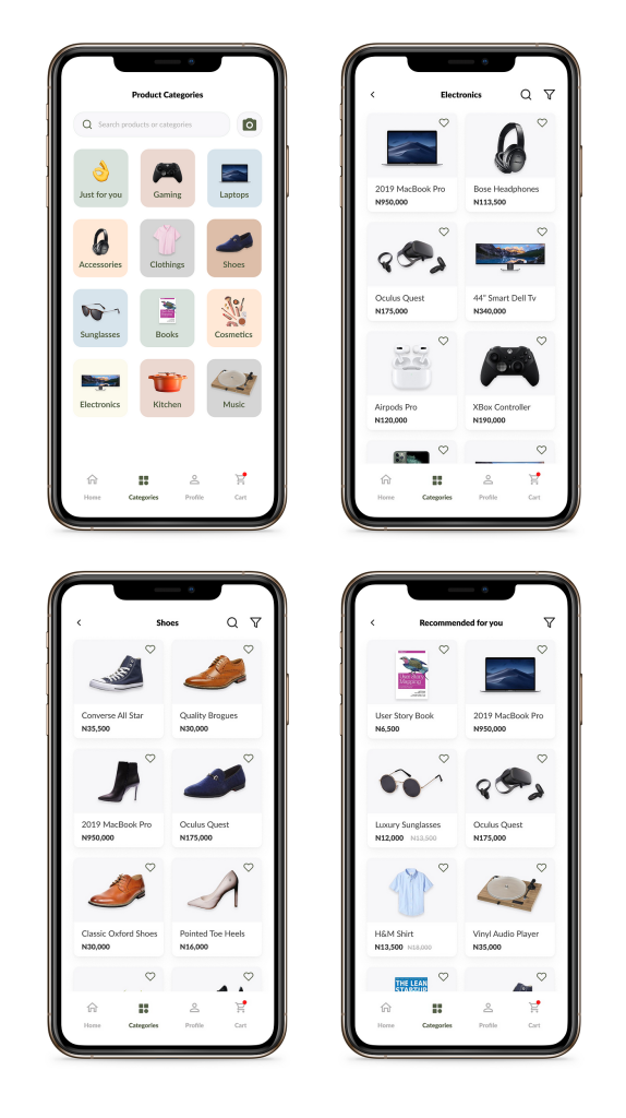
Airbnb
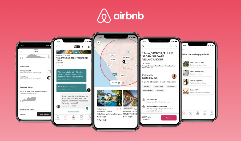
Airbnb revamped its UI/UX to create a more user-centric experience. They focused on simplifying navigation and improving mobile functionality. As a result, they saw a significant increase in bookings and user engagement. This case study shows how investing in UI/UX can yield substantial returns.
Amazon
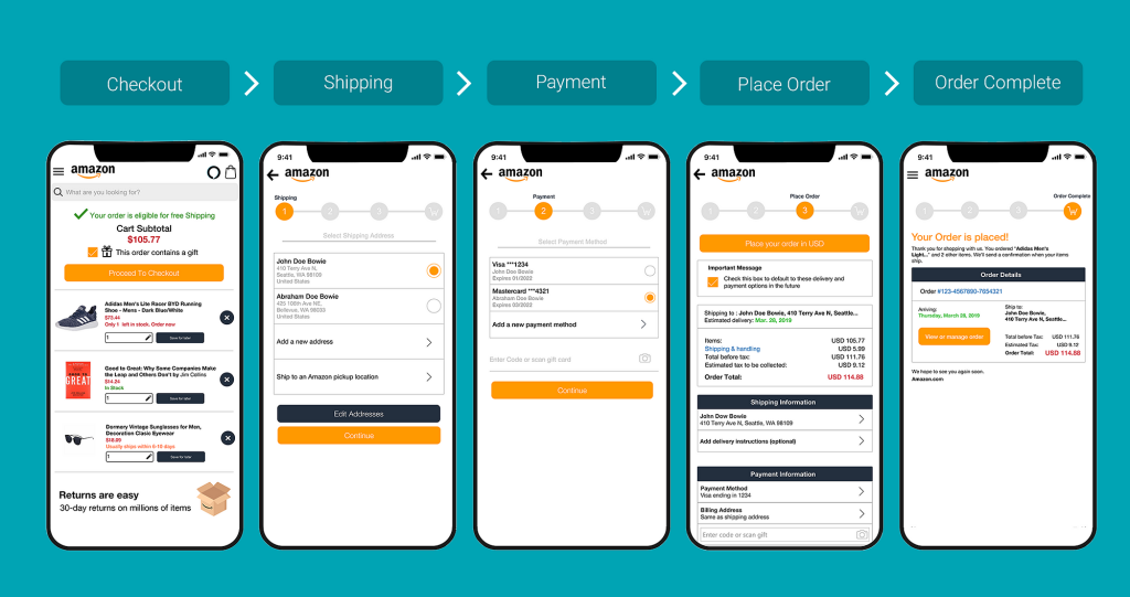
Amazon is known for its relentless focus on user experience. By continuously optimizing their UI and UX, they’ve managed to create an intuitive and efficient shopping experience. Features like personalized recommendations, one-click purchasing, and efficient navigation contribute to their high conversion rates and customer loyalty.
Slack
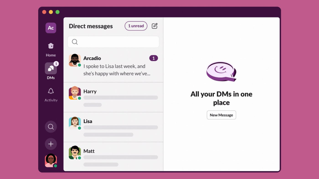
Slack’s success can be attributed to its exceptional UX design. The platform is user-friendly, with a clean interface and seamless navigation. This focus on UX has helped Slack become a leading communication tool for businesses worldwide.
Conclusion
In the digital age, UI/UX is not just a nice-to-have; it’s a necessity. A well-designed user interface and a smooth user experience can significantly impact your digital marketing efforts, from improving SEO to increasing conversions and customer loyalty. By simplifying navigation, optimizing for mobile, and focusing on speed, you can create a website that not only attracts visitors but keeps them coming back.
For more insights on improving UI/UX and enhancing your digital marketing strategy, check out these resources:
- Nielsen Norman Group
- Smashing Magazine
- Google’s UX Playbook for Retail
- HubSpot’s Ultimate Guide to UX Design
- Interaction Design Foundation
Thank you for taking the time to read this comprehensive guide on the importance of digital presence for business. We hope you found it informative and helpful. If you have any questions or need further assistance, please don’t hesitate to reach out.


