The Most Important KPIs Metrics for Your Mobile App

The seventh image shows a top-down view of a group of people sitting around a large wooden table, each using various electronic devices like laptops, tablets, and smartphones. In the center of the table, the words "KPI" (Key Performance Indicator) are prominently displayed, surrounded by various graphical elements such as charts, graphs, and data visualizations. These elements emphasize the focus on tracking and measuring key performance indicators within a business or team setting.

Are you looking to transform your mobile app’s performance but unsure which metrics to focus on? Dive into our comprehensive guide on The Most Important KPIs Metrics for Your Mobile App. This blog post will unravel the essential KPIs that are pivotal for understanding user behavior, app performance, and overall success. From user growth rate to lifetime value and cost per acquisition, we’ve covered everything you need to track and measure effectively. Whether you’re a developer or marketer, these insights will help you make data-driven decisions to drive your app’s growth and user satisfaction.

Understanding KPIs for Mobile Apps

Before we dive into the specifics, let’s clarify what KPIs (Key Performance Indicators) are. KPIs are measurable values that demonstrate how effectively an app is achieving its business objectives. For mobile apps, these metrics are vital to understanding user behavior, app performance, and overall success.

What is KPI in Mobile Apps?

A KPI in mobile apps is a metric used by developers and marketers to gauge the effectiveness of their app store optimization efforts and the attractiveness of their app to potential users (Sendbird).

Why Are KPIs Important?

KPIs help you make data-driven decisions. They let you know how well your app performs in critical areas by keeping tabs on the data, processing it, and reporting back to you (AppsFlyer).

Most Important KPIs Metrics for Your Mobile App

Transitioning to the key metrics, we’ll discuss the most significant KPIs you need to monitor to ensure your app’s growth and user satisfaction.

1. User Growth Rate

The eighth image is an instructional graphic that explains how to calculate the growth rate. It is divided into three sections:

The formula for growth rate:

Growth Rate
=
present
−
past
past
Growth Rate= 
past
present−past
​
 
The terms "present" and "past" are color-coded in blue and red, respectively.

An example calculation using the formula:

Growth Rate
=
310
−
205
205
Growth Rate= 
205
310−205
​
 
Here, the values 310 (present) and 205 (past) are plugged into the formula.

The result of the example calculation:

Growth Rate
=
0.51
Growth Rate=0.51
This graphic is from WikiHow and is designed to provide a clear, step-by-step visual explanation of how to determine the growth rate. KPIs

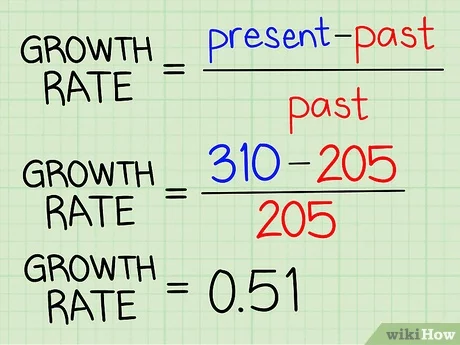
User growth rate is crucial as it shows how fast your app is gaining new users. This metric is essential for understanding your app’s adoption and popularity over time.

Example:

Imagine you launched a fitness app. Tracking the user growth rate would help you see if your marketing efforts are effective and if users are interested in your app.

2. Retention Rate

The ninth image is an instructional graphic that explains how to calculate the Customer Retention Rate (CRR). The formula is displayed as follows:

(
CE
−
CN
CS
)
×
100
=
Customer Retention Rate
( 
CS
CE−CN
​
 )×100=Customer Retention Rate
CE
CE: the number of customers at the end of the period (indicated in pink).
CN
CN: the number of new customers acquired during the period (indicated in teal).
CS
CS: the number of customers at the start of the period (indicated in orange).
This formula helps to determine the percentage of customers retained over a specific period, highlighting the importance of customer retention in business performance (KPIs).

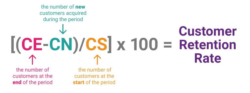
Retention rate measures the percentage of users who continue to use your app over a specific period. A high retention rate indicates user satisfaction and app value.

Example:

For a meditation app, a high retention rate might show that users find the sessions helpful and keep coming back for more.

3. Conversion Rate

The tenth image presents a formula for calculating the Conversion Rate KPIs. The layout is clean and straightforward, emphasizing the calculation:

Conversion Rate
=
(
Number of Conversions
Total Visitors
)
×
100
Conversion Rate=( 
Total Visitors
Number of Conversions
​
 )×100
The "Number of Conversions" is represented by a yellow circle with an icon of a handshake, indicating successful conversions or actions taken by users.
The "Total Visitors" is represented by a green circle with an icon of a star, indicating the total number of people who visited the site or page.
The formula is visually explained to help understand how to measure the effectiveness of marketing efforts by determining the percentage of visitors who complete a desired action.

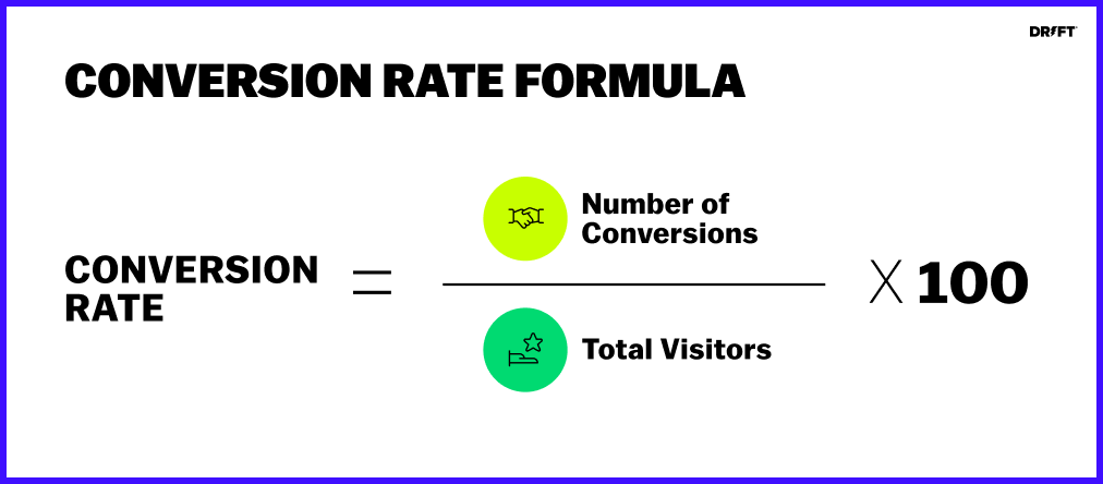
Conversion rate is the percentage of users who complete a desired action, such as making a purchase or signing up for a newsletter. This metric is vital for understanding how well your app converts users.

Example:

If you have an e-commerce app, the conversion rate would tell you how many users are making purchases after browsing products.

4. Daily Active Users (DAU) and Monthly Active Users (MAU)

The eleventh image illustrates the formula for calculating the DAU/MAU ratio KPIs, which measures user engagement over time. The formula is presented as follows:

DAU/MAU ratio
=
(
Daily active users
Monthly active users
)
×
100
DAU/MAU ratio=( 
Monthly active users
Daily active users
​
 )×100
The left side features a blue circle labeled "DAU/MAU ratio."
The right side shows the fraction of "Daily active users" over "Monthly active users," multiplied by 100 to convert it into a percentage.
This ratio helps understand the frequency of user engagement by comparing daily active users to monthly active users, providing insights into user retention and stickiness of a product or service.

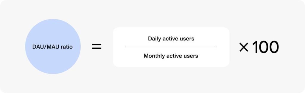
DAU and MAU metrics measure the number of unique users engaging with your app daily and monthly, respectively. These metrics help you understand user engagement and app popularity.

Example:

A social media app with a high DAU and MAU indicates a strong and engaged user base.

5. Churn Rate

The twelfth image presents a formula for calculating the Churn Rate KPIs, which measures the percentage of customers who stop using a service over a specific time period. The formula is displayed as follows:

Churn Rate
=
(
Customers at the beginning of the time period
−
Customers at the end of the time period
Customers at the beginning of the time period
)
×
100
Churn Rate=( 
Customers at the beginning of the time period
Customers at the beginning of the time period−Customers at the end of the time period
​
 )×100
The numerator calculates the difference between the number of customers at the beginning and the end of the time period.
The denominator is the number of customers at the beginning of the time period.
The result is then multiplied by 100 to convert it into a percentage.
This formula helps businesses understand the rate at which they are losing customers, which is crucial for improving customer retention strategies.

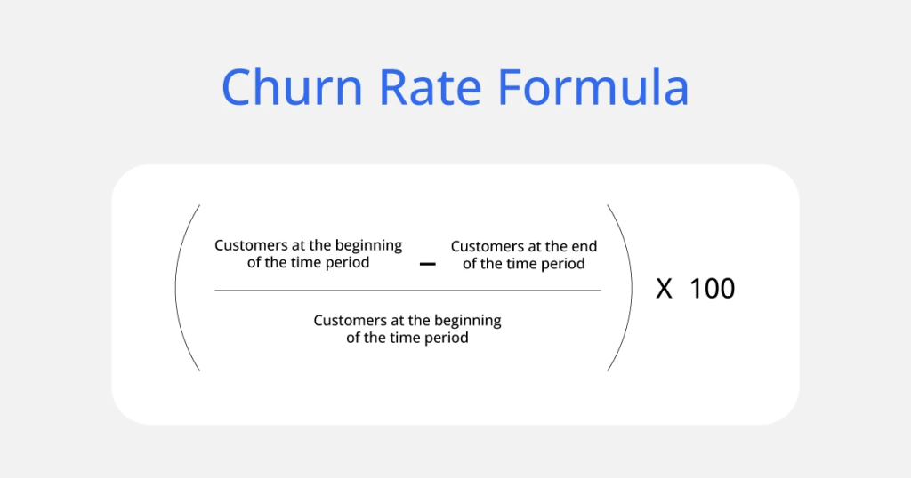
Churn rate measures the percentage of users who stop using your app over a certain period. Reducing churn rate is crucial for retaining users and maintaining growth.

Example:

If a gaming app has a high churn rate, it may indicate that users are losing interest or facing issues within the app.

6. Average Session Length

The thirteenth image displays a metric related to Average Session Duration KPIs. The layout is simple and focuses on the main information:

"Average Session Duration" is written at the top.
The duration is prominently displayed as "2m 41s" (2 minutes and 41 seconds) in large, bold font.
Below the duration, an upward green arrow indicates an increase, accompanied by "+8.3%," showing the percentage change compared to the previous 30 days.
At the bottom, there's a note "vs previous 30 days," providing context for the comparison.
This graphic effectively communicates an increase in the average session duration over the last 30 days.

Average session length indicates how much time users spend on your app per session. This metric helps you understand user engagement and app usability.

Example:

A news app with a high average session length suggests that users find the content engaging and spend more time reading articles.

7. Session Interval

The fourteenth image shows a user interface with a list of statuses indicating the last time different users were online. Each status includes a small icon of a person and the text "Last online" followed by the time elapsed since the user was last active. The statuses are:

Last online 2 hours ago (highlighted in green)
Last online 56 minutes ago
Last online 9 hours ago
Last online yesterday
Last online 5 hours ago
Last online 56 minutes ago
This layout is commonly found in online platforms or messaging applications to show the last activity of users.

Session interval measures the time between two consecutive sessions by the same user. A shorter session interval usually indicates higher user engagement.

Example:

For a health tracking app, a short session interval might show that users are frequently updating their health data.

8. Lifetime Value (LTV)

The fifteenth image explains the formula for calculating Customer Lifetime Value (LTV) KPIs. The formula is presented as follows:

LTV
=
(
Average Revenue Per User (ARPU)
×
Gross Margin
Churn Rate
)
LTV=( 
Churn Rate
Average Revenue Per User (ARPU)×Gross Margin
​
 )
Average Revenue Per User (ARPU): The revenue generated per user.
Gross Margin: The percentage of revenue that exceeds the cost of goods sold.
Churn Rate: The percentage of customers who stop using the service over a given period.
This formula helps businesses determine the total revenue expected from a customer over their lifetime, accounting for revenue per user, profitability, and customer retention.

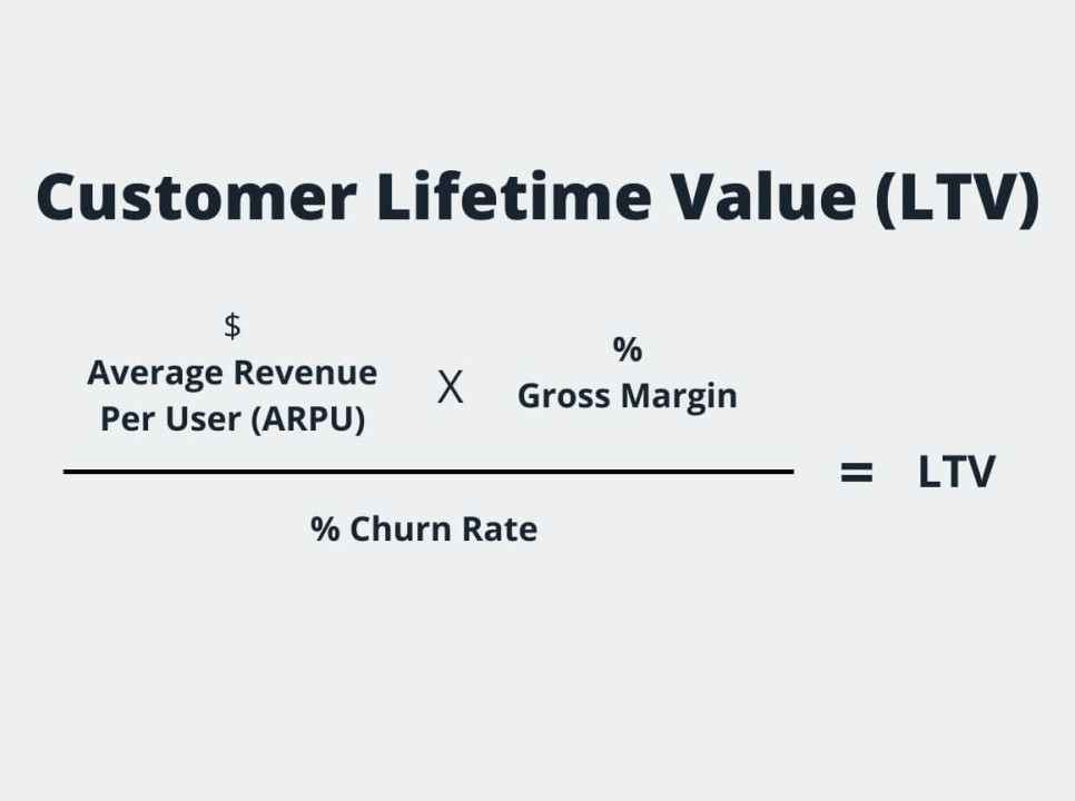
LTV is the total revenue generated by a user over their entire relationship with your app. This metric helps you understand the long-term value of your users.

Example:

A subscription-based app can use LTV to predict future revenue and plan marketing strategies accordingly.

9. Cost Per Acquisition (CPA)

The sixteenth image illustrates the formula for calculating Cost Per Acquisition (CPA). The formula is displayed as follows:

CPA
=
Spend ($)
Conversions
CPA= 
Conversions
Spend ($)
​
 
Spend ($): The total amount of money spent on marketing or advertising.
Conversions: The number of successful conversions (e.g., sales, sign-ups).
This formula helps businesses determine the cost associated with acquiring each customer through marketing efforts.

The image includes a simple icon of a dollar sign with an arrow, and the formula is labeled with "digitalmediametrics.com" at the bottom, indicating the source.

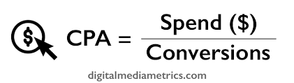
CPA measures the cost of acquiring a new user. This metric is essential for optimizing marketing budgets and ensuring cost-effective user acquisition strategies.

Example:

If you spend $10 on advertising to acquire a user for a travel app, the CPA would be $10.

10. Average Revenue Per User (ARPU)

The seventeenth image presents the formula for calculating Average Revenue Per User (ARPU). The formula is displayed as follows:

Average Revenue Per User (ARPU)
=
Total Revenue
Total Number of Users
Average Revenue Per User (ARPU)= 
Total Number of Users
Total Revenue
​
 
Total Revenue: The total income generated from all users.
Total Number of Users: The total number of users or customers.
This formula helps businesses understand how much revenue, on average, each user generates, which is useful for assessing profitability and user value.

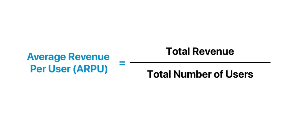
ARPU measures the average revenue generated per user. This metric helps you understand the revenue potential of your user base.

Example:

For a music streaming app, ARPU can help determine how much revenue is generated from subscription fees and in-app purchases.

How to Measure Mobile App Performance?

Transitioning to the implementation part, let’s explore how you can measure these KPIs effectively.

User Analytics Tools

The eighteenth image shows a comprehensive dashboard interface for product metrics related to riders. Here are the key sections and data visualizations presented:

Rider Activation:

A bar chart showing different stages such as First App Open, Sign Up, and Log In, with percentages indicating completion rates.
Rides Completes:

A large number indicating the total unique rides completed, which is 6,083.
New Rewards Users:

A line chart depicting the number of users who signed up for rewards over the last 30 days.
Rides by Mobile OS:

A pie chart showing the distribution of rides by mobile operating systems (Chrome and Firefox), with a total of 29.6K rides.
Rides by Country:

A horizontal bar chart listing different countries and the corresponding value of rides in each, with the United States leading at 23.7K rides.
Retained Riders:

A line chart showing rider retention over time, indicating the average retention rate over different periods (1 week, 1 month, etc.).
The dashboard layout is designed for easy navigation and quick insights into various metrics related to rider activity and engagement.

Using user analytics tools like Google Analytics, Mixpanel, or Firebase can help you track and measure KPIs accurately.

Regular Reporting

Regular reporting and analysis of KPIs will ensure you stay on top of your app’s performance and can make data-driven decisions.

User Feedback

The nineteenth image is designed to collect and illustrate feedback. It features a simple and colorful design with the following elements:

The word "FEEDBACK" is prominently displayed in the center on a white signboard, held by hands.
Above the signboard, there are two hand icons, one giving a thumbs-up and the other giving a thumbs-down, representing positive and negative feedback.
Below the signboard, there are three face icons representing different levels of satisfaction:
A red sad face for negative feedback.
A yellow neutral face for average or indifferent feedback.
A green happy face for positive feedback.
The background is light blue, which keeps the focus on the feedback elements.

Collecting and analyzing user feedback can provide insights into areas of improvement and help you understand user satisfaction.

FAQs

Here are some common questions people also ask about mobile app KPIs:

What is KPI to measure performance of an application?

KPI stands for “key performance indicator.” It is any measurable piece of data attributed to a user. KPIs let you know how well your app performs in critical areas by keeping tabs on the data, processing it, and reporting back to you (AppsFlyer).

How to measure if an app is successful?

To measure a mobile app’s success, track key metrics like user acquisition, engagement (daily active users/monthly active users), retention rates, session duration, and in-app behavior. Monitor revenue-related metrics such as lifetime value, conversion rates, and churn rate.

How to measure mobile app performance?

To measure mobile app performance, track metrics such as user growth rate, mobile downloads, app retention rate, crashes, session length and depth, daily active users (DAU) & monthly active users (MAU), app churn rate, and average revenue per user (ARPU) (UXCam).

Why are KPIs important for mobile apps?

KPIs are important because they help developers and marketers understand how effectively their app is achieving its business objectives. KPIs provide insights into user behavior, app performance, and overall success, enabling data-driven decisions.

What are some examples of key performance indicators for mobile apps?

Some examples of key performance indicators for mobile apps include user growth rate, retention rate, conversion rate, daily active users (DAU), monthly active users (MAU), churn rate, average session length, session interval, lifetime value (LTV), cost per acquisition (CPA), and average revenue per user (ARPU).

Conclusion

Monitoring the right KPIs is crucial for the success of your mobile app. By focusing on user growth rate, retention rate, conversion rate, DAU and MAU, churn rate, average session length, session interval, LTV, CPA, and ARPU, you can gain valuable insights into your app’s performance and make data-driven decisions to enhance user experience and drive growth. Regularly tracking these metrics and using the right tools will ensure your app stays on the path to success.

Thank you for taking the time to read this comprehensive guide on the importance of digital presence for business. We hope you found it informative and helpful. If you have any questions or need further assistance, please don’t hesitate to reach out.

cloud-1.png-7
hire us

Got a projet?

Let’s talk

Share This Post

More to explore